博客

  • 判断浏览器是否支持css3某属性

    css3的出现让浏览器的表现更加的丰富多彩,表现冲击最大的就是动画了,在日常书写动画的时候,很有必要去事先判断浏览器是否支持,尤其是在写CSS3动画库的时候。比如transition的animation-play-state,就只有部分浏览器支持。

    function supportCss3(style) { 
     var prefix = ['webkit', 'Moz', 'ms', 'o'], 
     i, 
     humpString = [], 
     htmlStyle = document.documentElement.style, 
     _toHumb = function (string) { 
     return string.replace(/-(\w)/g, function ($0, $1) { 
     return $1.toUpperCase(); 
     }); 
     }; 
     
     for (i in prefix) 
     humpString.push(_toHumb(prefix[i] + '-' + style)); 
     
     humpString.push(_toHumb(style)); 
     
     for (i in humpString) 
     if (humpString[i] in htmlStyle) return true; 
     
     return false; 
    }

    alert(supportCss3(‘animation-play-state’));

  • CSS3条件判断——@supports

    @supports (display:flex) {
     section { display: flex }
     ...
    }

    上面这段代码的意思是:如果浏览器支持“display:flex”属性,那么在“section”元素上就运用“display:flex”样式。

    not逻辑声明——排除

    @supports not (display: flex){
     #container div{float:left;}
    }

    上面的代码表示的是,如果你的浏览器不支持“display:flex”属性,那么你可以使用“float:left”来替代。


    and逻辑声明——联合(与)

    @supports (column-width: 20rem) and (column-span: all) {
     div { column-width: 20rem } 
     div h2 { column-span: all }
     div h2 + p { margin-top: 0; }
     ...
    }

    上面的代码表示的是,如果你的浏览器同时支持“column-width:20rem”和“column-span:all”两个条件,浏览器将会调用下面的样式


    or逻辑声明——or(或)

    @supports (display: -webkit-flex) or (display: -moz-flex) or (display: flex) {
     section {
     display: -webkit-flex;
     display: -moz-flex;
     display: flex;
     …
     } 
    }

    只要支持其中一种就执行里面代码


    “or”和“and”混用

    @supports ((transition-property: color) or (animation-name: foo)) and (transform: rotate(10deg)) {
     // ...
    }
    @supports (transition-property: color) or ((animation-name: foo) and (transform: rotate(10deg))) {
     // ...
    }
  • angularjs filter 过滤器例子

    1,uppercase,lowercase大小转换

    {{ “lower cap string” | uppercase }} //结果:LOWER CAP STRING
    {{ “TANK is GOOD” | lowercase }} //结果:tank is good
    2,json格式化

    {{ {foo: “bar”, baz: 23} | json }} //结果:{ “foo”: “bar”, “baz”: 23 }

    (注意:bza没格式前是没有双引号的,格式化后就转换成了json数据了。)
    3,date格式化

    date1

    date2
    4,number格式化

    {{ 1.234567 | number:1 }} //结果:1.2
    {{ 1234567 | number }} //结果:1,234,567
    5,currency货币格式化

    {{ 250 | currency }} //结果:$250.00
    {{ 250 | currency:”RMB ¥ ” }} //结果:RMB ¥ 250.00


    6,filter查找
    第一个参数可以是:字符串,对象,函数

    {{ [{“age”: 20,”id”: 10,”name”: “iphone”},
    {“age”: 12,”id”: 11,”name”: “sunm xing”},
    {“age”: 44,”id”: 12,”name”: “test abc”}
    ] | filter:’s’}} //查找含有有s的行

    //上例结果:[{“age”:12,”id”:11,”name”:”sunm xing”},{“age”:44,”id”:12,”name”:”test abc”}]

    {{ [{“age”: 20,”id”: 10,”name”: “iphone”},
    {“age”: 12,”id”: 11,”name”: “sunm xing”},
    {“age”: 44,”id”: 12,”name”: “test abc”}
    ] | filter:{‘name’:’iphone’} }} //查找name为iphone的行

    //上例结果:[{“age”:20,”id”:10,”name”:”iphone”}]


    {{ [‘Ari’,’likes’,’to’] | filter:run }}

    //上例结果: [“Ari”]

    $scope.run=function(str){
    return str[0]==str[0].toUpperCase();
    }
    7,limitTo字符串,对像的截取
    {{ “i love tank” | limitTo:6 }} //结果:i love
    {{ “i love tank” | limitTo:-4 }} //结果:tank

    {{ [{“age”: 20,”id”: 10,”name”: “iphone”},
    {“age”: 12,”id”: 11,”name”: “sunm xing”},
    {“age”: 44,”id”: 12,”name”: “test abc”}
    ] | limitTo:1 }} //结果:[{“age”:20,”id”:10,”name”:”iphone”}]
    8,orderBy对像排序


    {{ [{“age”: 20,”id”: 10,”name”: “iphone”},
    {“age”: 12,”id”: 11,”name”: “sunm xing”},
    {“age”: 44,”id”: 12,”name”: “test abc”}
    ] | orderBy:’id’:true }} //根id降序排

    {{ [{“age”: 20,”id”: 10,”name”: “iphone”},
    {“age”: 12,”id”: 11,”name”: “sunm xing”},
    {“age”: 44,”id”: 12,”name”: “test abc”}
    ] | orderBy:’id’ }} //根据id升序排
    9,自定义过滤器filter
    将字符串的首字母换成大写
    angular.module(‘myapp’,[]).filter(‘myfilter’,function(){
    return function(str){
    if(str){
    return input[0].toUpperCase()+str.slice(1);
    }
    }
    })
    {{‘my name is chenge’ | lowercase | myfilter}}

    //结果:My name is chenge

    http://blog.51yip.com/jsjquery/1592.html

  • css3笔记

    -ms- /* IE 9 */
    -webkit- /* Safari and Chrome */
    -o- /* Opera */
    -moz- /* Firefox */


    CSS3 2D转换

    // transform多属性写法
    transform: translate(-960px, 0px) translateZ(0px);

    transform: translate(50px,100px); 移动位置,X轴50 Y轴100    手机设备加速模式:transform: translate3d(0px, 0px, 0px);

    element.style.transform = 'translate3d(500px,0,0)';
    element.style.OTransform = 'translate3d(500px,0,0)'; // Opera
    element.style.msTransform = 'translate3d(500px,0,0)'; // IE 9
    element.style.MozTransform = 'translate3d(500px,0,0)'; // Firefox
    element.style.WebkitTransform = 'translate3d(500px,0,0)'; // Safari and Chrome

    transform: rotate(30deg); 旋转,顺时针30度

    transform: scale(2,4); 拉伸,宽为原来2倍,高为原来4倍

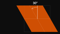
    transform: skew(30deg,20deg); (解释抽象直接去,CSS88看效果)

    transform:skew(30deg,10deg),图解

    skew-x-y

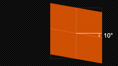
    transform:skewX(30deg)  //如果只设置X轴只能在水平方向在改变形状,如图

    skew-x


    transform:skewY(10deg) //如果只设置Y轴只能在垂直方向在改变形状,如图

    skew-y


    transform:matrix(); 此属性都可以代替以上的属性
    伸缩例子:http://www.zhangxinxu.com/study/201206/css3-transform-matrix-scale.html
    角度旋转:http://www.zhangxinxu.com/study/201206/css3-transform-matrix-rotate.html
    skew:http://www.zhangxinxu.com/study/201206/css3-transform-matrix-skew.html


    transform-origin 改变中心点 http://www.w3school.com.cn/cssref/pr_transform-origin.asp

    -webkit-transform-style:preserve-3d这个属性告诉浏览器,所有transform变换都是在3D空间中的变换,而不是在2D空间中。

    transform-style 属性规定如何在 3D 空间中呈现被嵌套的元素。

    preserve-3d  子元素将保留其 3D 位置。

    (例如要做出一个3D例如正方形就需要设置这个属性)

    ——————————————————————–

    -webkit-
    -moz-
    CSS3 3D 转换

    要做3D效果就需要把某场景设置为3D舞台

    在某div中设置transform-style: preserve-3d后作用于此div的后代元素,在此div里面的元素就能设置3D效果了。

    transform-style: flat|preserve-3d; 
    transform-style: flat; // 默认,子元素将不保留其 3D 位置 
    transform-style: preserve-3d; // 子元素将保留其 3D 位置。

    能设置3D属性,也就是在二维的基础上多了Z属性,如:

    位移:transform:translateZ(10px);
    合并为transform:translate3d(x,y,z);
    --------------------------------------------
    缩放:transform:scaleZ(2);
    transform:scale3d(number,number,number);
    --------------------------------------------
    旋转:transform:rotateZ(30deg);
    transform:rotate3d(Xangle,Yangle,Zangle)
    
    可以这么写:transform: translate3d(-50%, -140.716px, 1px) scale3d(1.108, 1.108, 1);


    transform: rotateX(120deg); 围绕X轴旋转 120度

    transform: rotateY(130deg);
    ——————————————————————–


    -moz-
    -webkit-
    -o-

    CSS3动画属性有两个

    transition 相当于补间动画

    animation 相当于关键帧动画

    Transform-style和Perspective属性

    创建3D CSS3场景它是最外层的div,用来提供一个3D场景,
    可以认为它是一个3D图形的展示平台,只有定义了这样一个div,才能够展示3D图形。

    为什么要创建3D场景呢?
    因为浏览器本身默认就是2D的场景,如果只是想实现2D效果就不需要创建2D场景了,
    3D就必须要创建了。

    创建3D场景如下:

    -webkit-perspective:800px; //物体离电脑有800像素距离,作用于元素的后代,而不是其元素本身。
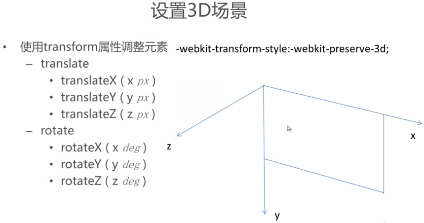
    -WebKit-perspective-origin: 50% 50%; //视点,物体在3D场景中间

    3DC

    在3D的世界里我们需要把坐标搞清楚。
    在3D世界中X轴就是屏幕顶部,Y轴就是屏幕左边,但是会多出一个Z轴,Z轴方向就是指向我们。

    3D_transform

    总结:想让元素有3D立体效果就需要一个3D舞台,还需要元素能设置3D属性如:

    -webkit-perspective:800px; //设置景深的效果
    -webKit-perspective-origin: 50% 50%; //视点,物体在3D场景中间
    -webkit-transform-style:preserve-3d; //让元素设置3D属性,z值


    CSS3过渡

    注意:要使用transition属性时,不要用style在当前元素上写样式,一般和样式的hover伪类配合。

    transition: width 2s linear 8s, height 2s linear 8s, transform 2s linear 8s;
    宽度过渡时间2秒内完成推迟8秒后执行,高度2秒内完成推迟8秒后执行 ,2D过渡2秒内完成推迟8秒后执行

    transition-property: none|all|property;     //要过度的属性

    transition-duration: time;   //过度开始到结束要的时间

    transition-timing-function: linear|ease|ease-in|ease-out|ease-in-out|cubic-bezier(n,n,n,n);    //过度速度  ,动画离线包 :cubic-bezier.com    动画设置:http://cubic-bezier.com/#.17,.67,.83,.67

    transition-delay: time;  //几秒后开始过度


    transition案例:transition_demo

    ——————————————————————–

    -moz-
    -webkit-
    -o-

    css3动画

    animation:myfirst 5s linear 2s infinite alternate; 调用动画函数myfirst,5秒内执行完此动画;推迟2秒执行;倒序执行


    @keyframes myfirst 设定动画函数 ,将时间分为4等分 0~25%,25%~50%,50%~70%,70%~100%,分别在不同时间段内的过渡效果
    {
    0% {background:red; left:0px; top:0px;} 0秒时
    25% {background:yellow; left:200px; top:0px;}
    50% {background:blue; left:200px; top:200px;}
    75% {background:green; left:0px; top:200px;}
    100% {background:red; left:0px; top:0px;}
    }


    animation 属性是一个简写属性,用于设置六个动画属性:
    animation-name   //动画名称
    animation-duration //动画开始到结束需要时间
    animation-timing-function  //动画加速度状态
    animation-delay   //几秒后开始动画
    animation-iteration-count  //动画播放次数
    animation-direction //动画是否要逆向播放回去

    animation-fill-mode  //设置,动画执行完成后保持在执行前状态还是之后状态,案例
    none:
    默认值。不设置对象动画之外的状态
    forwards:
    设置对象状态为动画结束时的状态
    backwards:
    设置对象状态为动画开始时的状态
    both:
    设置对象状态为动画结束或开始的状态
    css animation的监听事件

    制作3D立体效果:http://www.jb51.net/css/455565.html


  • css3在线参考手册

    css3在线参考手册属性齐全,附加例子

    http://www.css88.com/book/css/